Nurture Plant App
Nurture Prototype
Nurture Prototype
Try out Nurture.
Background
Overview:
Nurture is a web app constructed using the design process and Figma. It provides clients with plant-care information, reminders for care, as well as specific guidance on care from local experts. Clients can set up a profile, a “garden” of owned plants, and a personalized care schedule.
Purpose and Context:
Nurture was a personal project grown from my interests in plant care and as part of my UX Immersion course at Careerfoundry. This project highlights my skills mastery as a UX Designer.
Objective:
The primary target of the project was to have a fully fleshed-out project to add to my professional portfolio. The problem I aimed to address with the app was to provide a creative and convenient one-stop-shop for busy plant parents on-the-go.
Duration:
The project took a total of ten months, and I had to ask for a few extensions. One reason was that I felt my quality of work suffered due to how busy I was working full-time as a teacher on top of doing this course part-time. I used the extra time to ensure that what I made would be of better quality.
Credits:
UI/UX Designer.
Tools, Skills, Methodologies:
Pen & Paper, Usability Hub, Google Docs, Marvel, Zoom, Look Back, Slack, Discord, Figma
The Problem
Young professionals need a way to care for their plants while leading busy lives.
The Solution
To design a mobile app that smoothly connects with busy professionals and plant lovers to establish plant care routines and succinct advice.
Craft a portal to connect with a plant expert who can give users advice for plant care.
Create a home base where users can log, track, and set reminders for plant care.
Innovate a way for users to search for concise information about a plant and care tips.
The Process
Competitive Analysis
User Research
Understanding the Problem
Information Architecture
Wireframing and Prototyping
Usability Testing
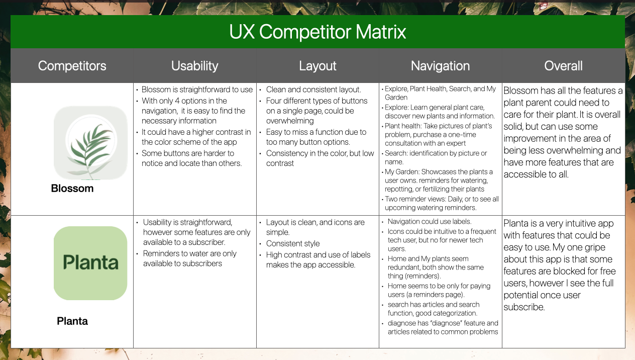
Competitive analysis
Main takeaway:
Competitive Analysis has allowed me to better comprehend the context of why clients may need a plant care app.
Simple, straightforward navigation, accessible information, and options to seek expert help seem to be the main selling points of the two plant apps I analyzed.
User Research
My goals for research included to discover what motivated users to seek an app, what plant-care friction points users experienced, and what features user needed.
Interview Questions
What types of plants do you own?
What are some reasons why you enjoy taking care of plants?
What are some of your favorite plants and why?
How do you use websites or apps when caring for plants? What got you into plants?
What are your favorite features of any existing app or website to help you with plant care?
What has been successful/unsuccessful?
What don’t you like about the current tools you use? Why?
Describe a situation in which you may need assistance when caring for plants.
If you utilize a service with an expert for caring for plants, what are you reasons for soing so/not doing so?
Affinity Mapping
Interview Analysis
I listened to the recordings of my interviewees and sorted my notes of their responses into Tasks, Feelings, Influences, Pain Points, and Overall Goals.
Main Takeaway
In summary, users prioritize concise, easily accessible, and relevant information for plant care, recognizing its positive impact on wellness, while stressing the need for improved accessibility and consideration of financial aspects.
Understanding the problem
I composed user personas and user journeys based on user research and analysis. User personas and user journeys help me as the designer to empathize and understand the problems that should be prioritized for solving.
Main Problems:
Users need away to search information easily and quickly.
Users need help from an expert on more advanced care.
Users need a way to track their care schedule while leading busy lives.
User persona Joyanna crafted from user interview responses.
The user journey identifies the user's thoughts and emotional journey and the opportunities that result from their journey.
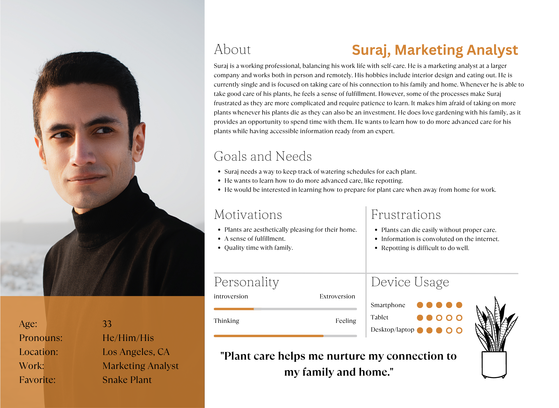
A second proto persona Suraj was created from the user interviews.
The user journey for Suraj.
Information Architecture
Once I understood what the main problems were, I completed a task analysis. This analysis allows me to fathom what tasks a user would want to undertake to solve their problems within the app. After determining the tasks, I started to brainstorm possible user flows that a user would take to complete these tasks.
Suraj wants to be able to repot his plant well by asking his expert for advice.
Suraj's user flow to contact an expert for potting advice.
Task Analysis for Joyanna, who wants to set up a care schedule and contact an expert for advice.
User Flow 1 for Joyanna logging in, setting up a profile, and setting care schedule.
User Flow for Joyanna scheduling an appointment with an expert
Card sorting and refining
After making my Proto Personas’ user flows, I now drafted a possible sitemap for the app. In order to confirm if the site map was clear, I conducted a card sort with 5 participants. Card sorting results helped me to better organize the sitemap.
Site map before card sorting.
Cart sort with feedback from 5 participants.
Site map after card sorting. Some screen names proved to be similar so they were changed to be more specific. Expert was expanded to include more options, and search and explore had overlap.
Wire Framing and prototyping
Initially I sketched paper wireframes. I had three flows: Contact an expert, search for a plant, and a “my plants” database that includes all the users’ plants.
Low Fidelity Prototype - Contact an expert, mobile and desktop.
Low Fidelity Prototype - Search for plants, mobile and desktop.
Low Fidelity Prototype - “My plants” database, mobile and desktop.
Usability Testing
Schedule:
Usability test sessions will take place between June 14 through 16th, 2023, over Zoom or Facetime. Sessions are scheduled between 2:00-8:00 PM on all three days.
Sessions:
10-20 minute usability test sessions.
Participants
The study will test 4 participants who were recruited through the researchers’ social media and network to participate in the study. Hana, Stephanie, Sijiya, Kim.
Equipment
Testing was carried out with a midfidelity wireframe of Nurture. Test participants used an iPhone 14 and I (the researcher) utilized a Macbook Pro. I conducted the tests on a platform named Lookback.
Scenario Tasks
I asked participants to complete four scenarios tasks and I recorded their reactions and comments. I wanted to see how easily participants navigated the app, and find out what friction points they would come across.
Task 1: You’re caring for a plant, and you want to learn about a new plant you recently obtained. Using Nurture, find a page that tells you all about your new plant.
Task 2: You’re finding that one of your plants is sick or needs extra attention. You find out you can ask an expert for help with your plant. Use nurture to book an appointment with an expert who can help you with your plant.
Analysis
From Lookback, I was able to transcribe my interviewees responses. I performed an affinity mapping to sort and organize their feedback into groups. From the groups, I then further analyzed the feedback into a rainbow spreadsheet which helped me visualize what the most pressing issues were with my midfidelity wireframes.
Note on Rainbow Spreadsheet:
I used an adapted version of Jakob Nielsons’s error scale
0 = I don’t agree that this is a usability problem at all.
1 = Cosmetic problem only: need not be fixed unless extra time is available on project.
2 = Minor usability problem: fixing this should be given low priority.
3 = Major usability problem: important to fix and should be given high priority.
4 = Usability catastrophe: imperative to fix before product can be released.
Affinity mapping and Rainbow Spreadsheet
Observational groups
Positive feedback groups
Negative feedback groups
Errors groups
Rainbow Spreadsheet using an adapted version of Jakob Nielsen’s four-step rating scale.
Test Report
I summarized the participants’ comments into a usability test report. I gave each issue a severity rating out of 5 based on the Jacob Nielson scale and came up with recommendations to solve the issue.
A few of the main issues included:
Users had trouble knowing which button to press in order to book an appointment with an expert.
Participants expressed wanting transparency in the booking process steps, costs, and benefits.
Participants wished cancelling the appointment was less confusing.
Before
Midfidelity - “Contact an Expert”
After
High Fidelity - “Contact an Expert”
Main Updates:
“Schedule” was renamed to “Book an Appointment”
Confirmation of booking added as a pop-up notification of confirming.
Hamburger menu eliminated from messaging feature.
Overall cosmetics improved and made to be consistent, using M3 guidelines.
Concluding Thoughts
My next step is to keep iterating on my current prototype and conduct another usability test with potential users. I will edit my prototype flow so it is more efficient. For instance, clients shouldn’t have to enter their credit card information every time they book an expert appointment, so I will add a “Save card” check box to make checkout faster. I will also make colors more uniform.
Main Takeaway
The Nurture Plant App project aimed to create a user-friendly web app for plant care, incorporating expert guidance and reminders. Through research and testing, it prioritized accessible and concise information, iteratively improving the prototype based on user feedback to better serve busy plant parents.


